Diagonal
/ Museumism SeriesDiagonal - Slice with light leaks
對角線
在這個由對角線一分為二的非典型的居住型態中,一側為公領域的探討,另一側為私人居住的隱密,彼此縫合而成。
賦予個人更豐富的思想與創意的精神生活。過往常見的住宅配置圖往往使用封閉、平整的隔間牆定義客餐廳、書房、臥室…等空間,而本案企圖打破制式的隔間僵局,使各個空間區域可視為開放的、碎片化、且複合式,延伸出新型態的住宅配置。
This unconventional residential layout is demarcated by a diagonal line, with one side devoted to exploring living space usage, and the other side is preserved for privacy. With these distinctive sections seamlessly enclosed together, it enriches the occupant's mind and creativity. While most apartment layouts often define spaces like the living room, dining room, study, and bedroom with partition walls, this project aims to break away from such typical configurations and introduce a new form that allows each space to be open, flat, and hybrid.

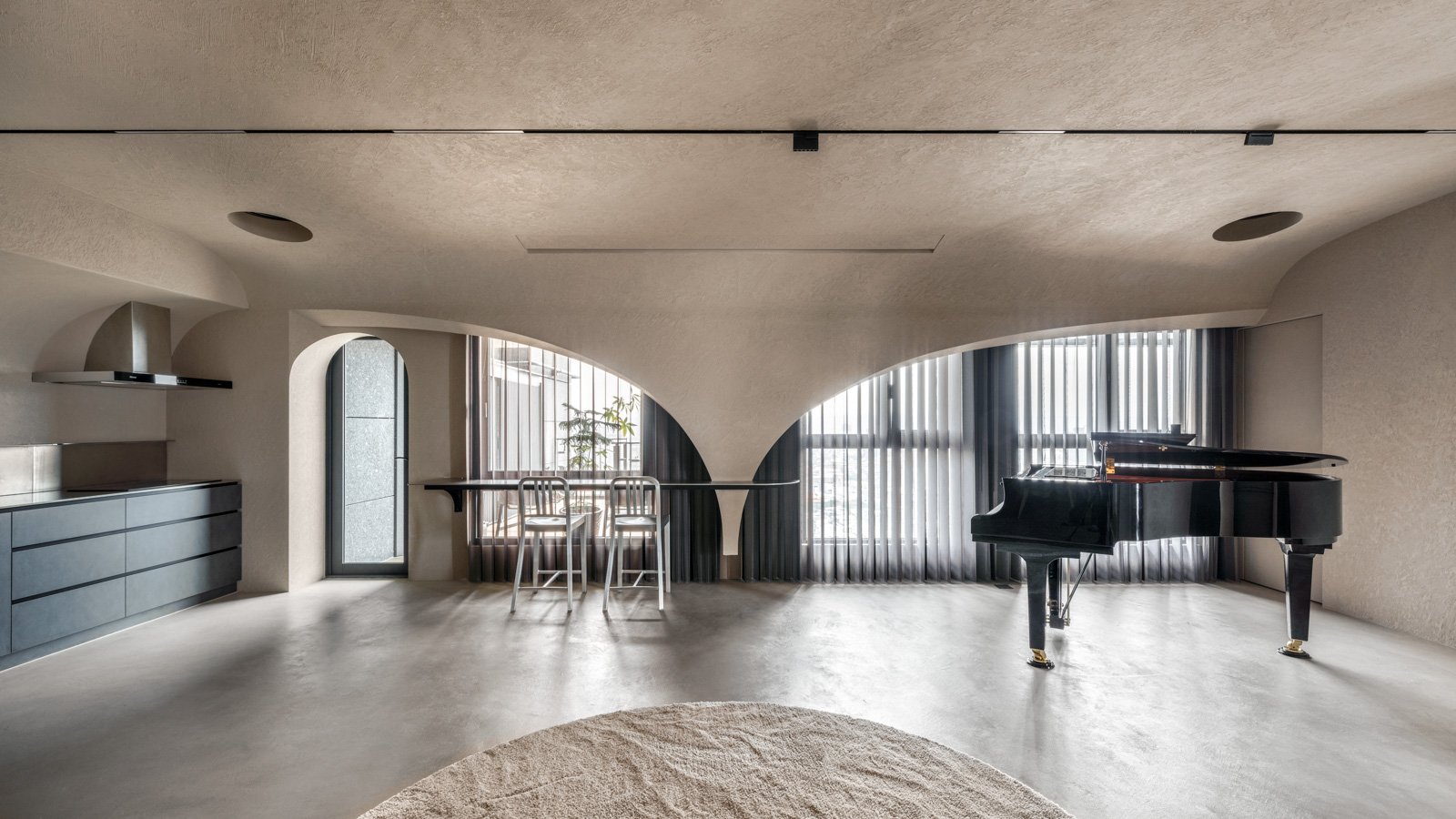
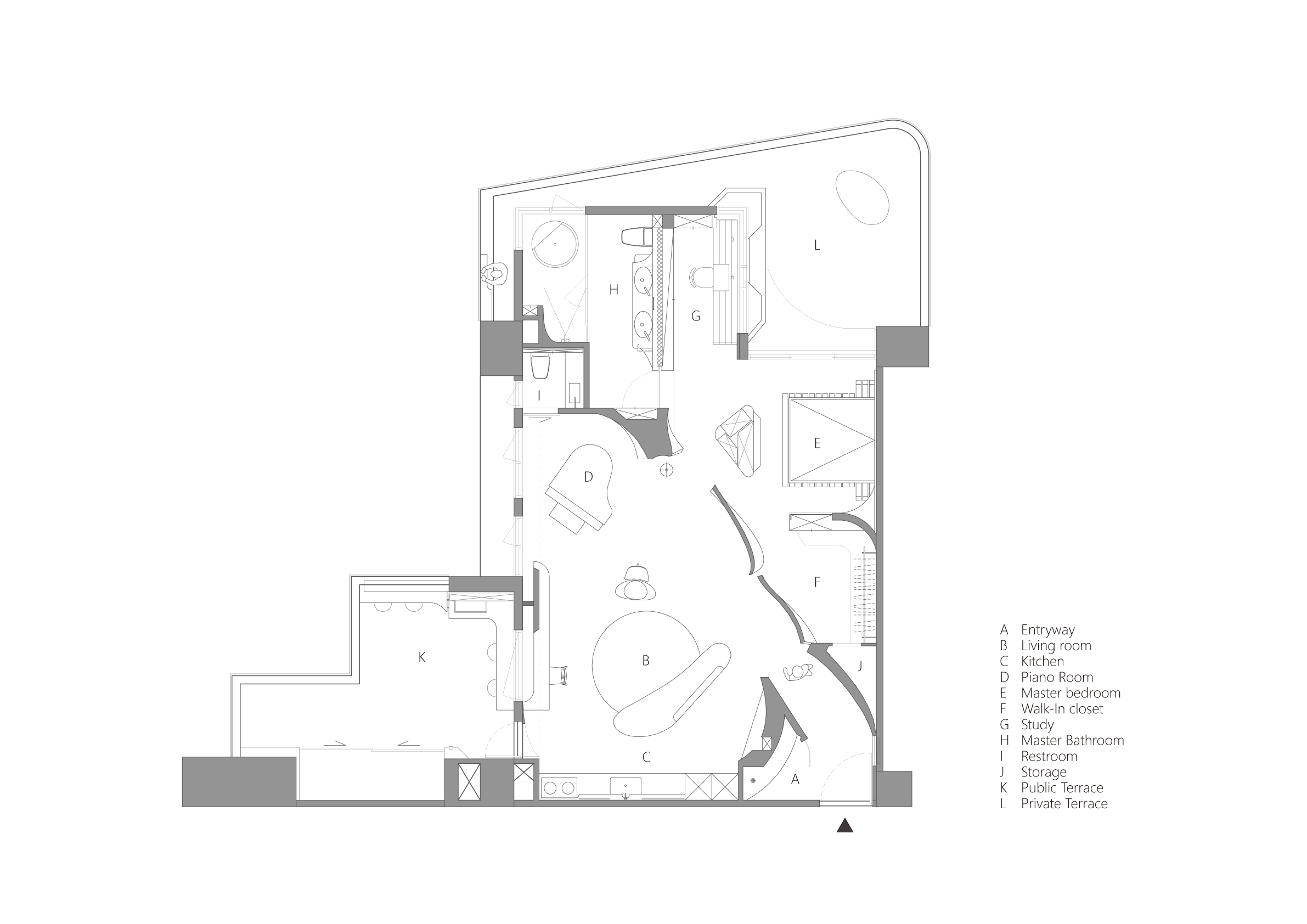
拆除新成屋標準三房格局中全數的隔間牆,並以大尺度的對角平面劃分了公共空間與私人領域,再以數個短跨距、片段的隔間牆,約略地縫合各個區域。
After demolishing all partition walls in the three-room layout, the public and private areas are spliced by a large-scale diagonal line connected with several short-width partition walls.


玄關直視可見的吊燈作為端景,而牆的兩側則暗示了公共區域和私人區域,沒有主牆的空間使傢俱配置更加自由,生活動線也多了更多可能性:在烹飪後,窗邊吧檯與沙發區皆可能為用餐空間;而琴房和客廳之間也不再有明確的界限,空間即是依傍在窗景前的Lounge;
Seen from the entrance, the pendant attracts attention as a focal point, with both sides suggesting the demarcation of public and private areas. Without any prominent partition walls, furniture placement becomes more flexible. For example, after cooking, both the windowsill bar section and the sofa area can serve as dining spaces. Furthermore, there is no longer a clear boundary between the piano room and the living area. The overall space appears as a lounge area bathed in sunlight.
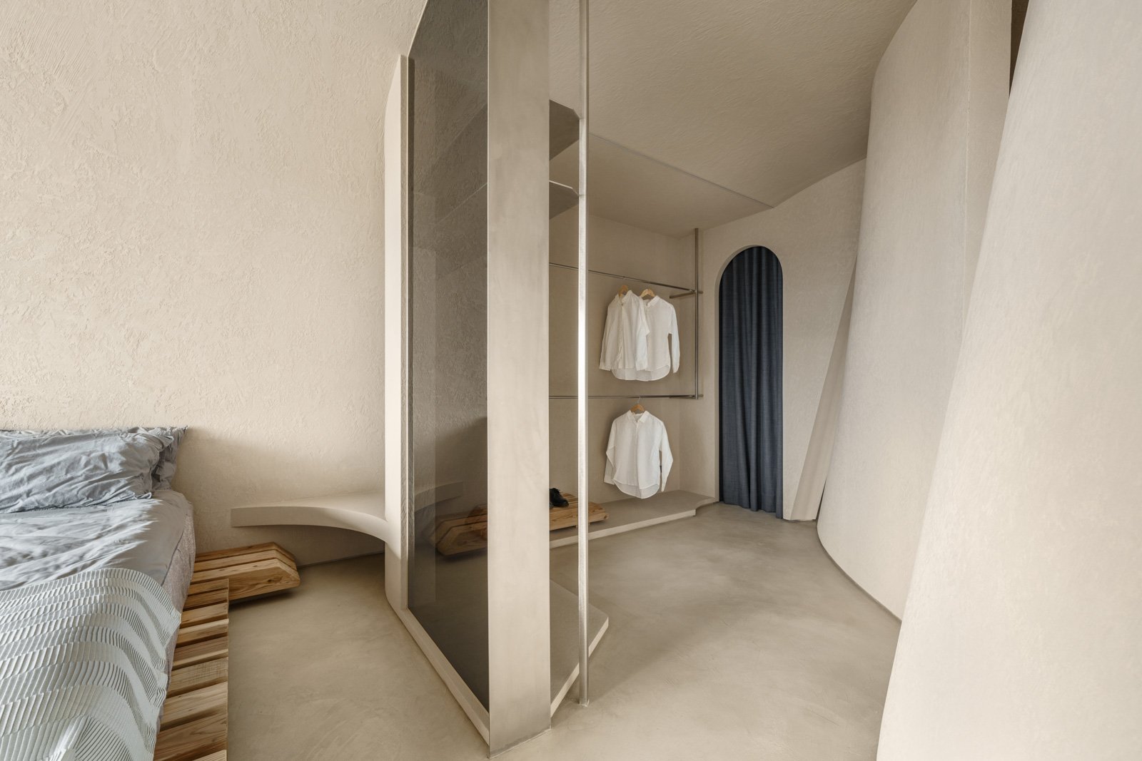
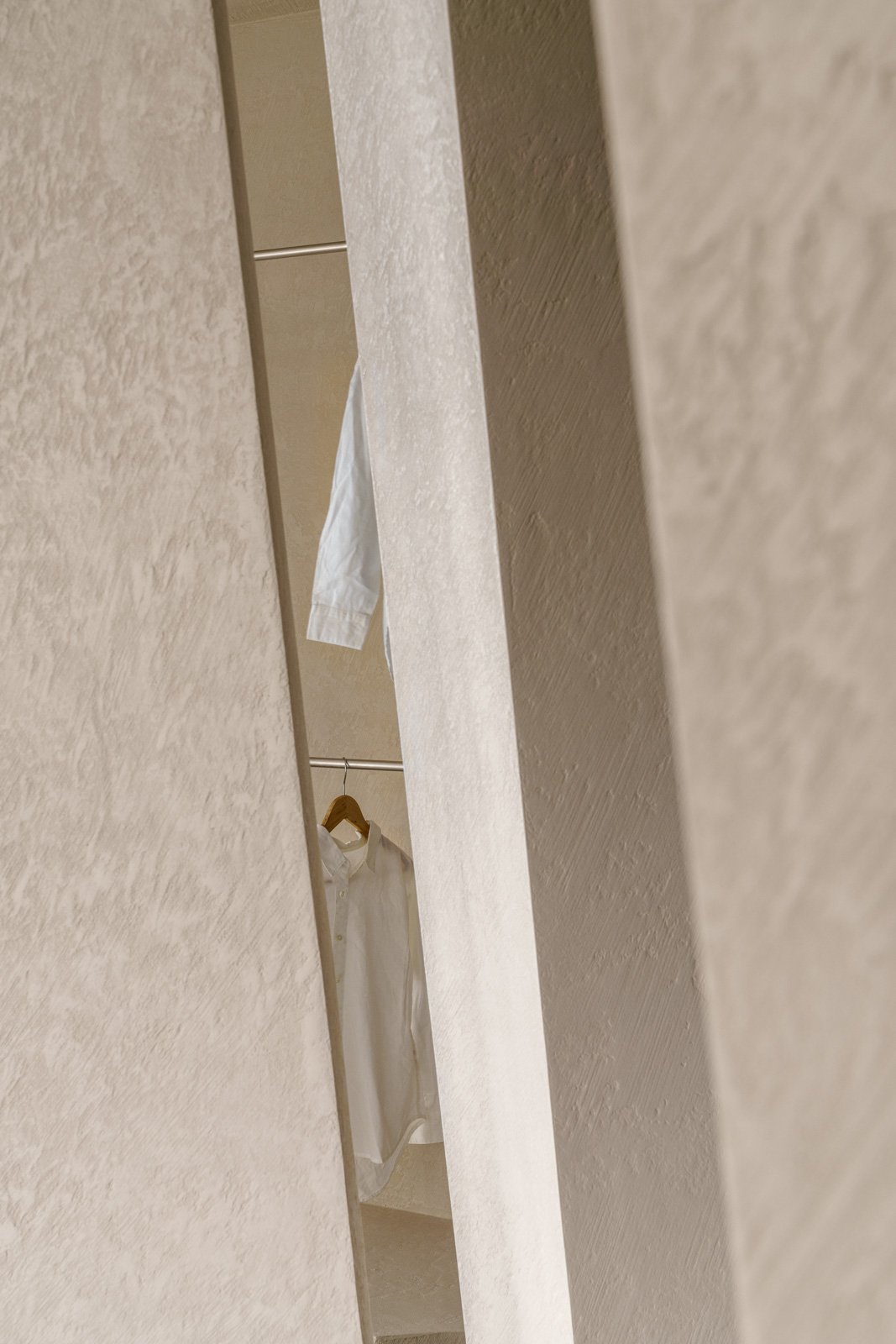
另一側的柱體則根據動線被切分成三個面向,定義了公區的展示架、臥室的電視牆、以及衛浴的盥洗櫃體,運用透光材質,使私區的更衣室、臥室、梳妝台,與臥室之間既有獨立性、亦保有視覺的穿透性。
On the other side, the pillar is built with three facets according to each area's functionality: defining the display shelf for the public area, the TV wall for the bedroom, and the cabinet for the bathroom. Incorporating transparent materials provides independence between the walk-in closet, bedroom, and vanity area while sustaining visual transparency.

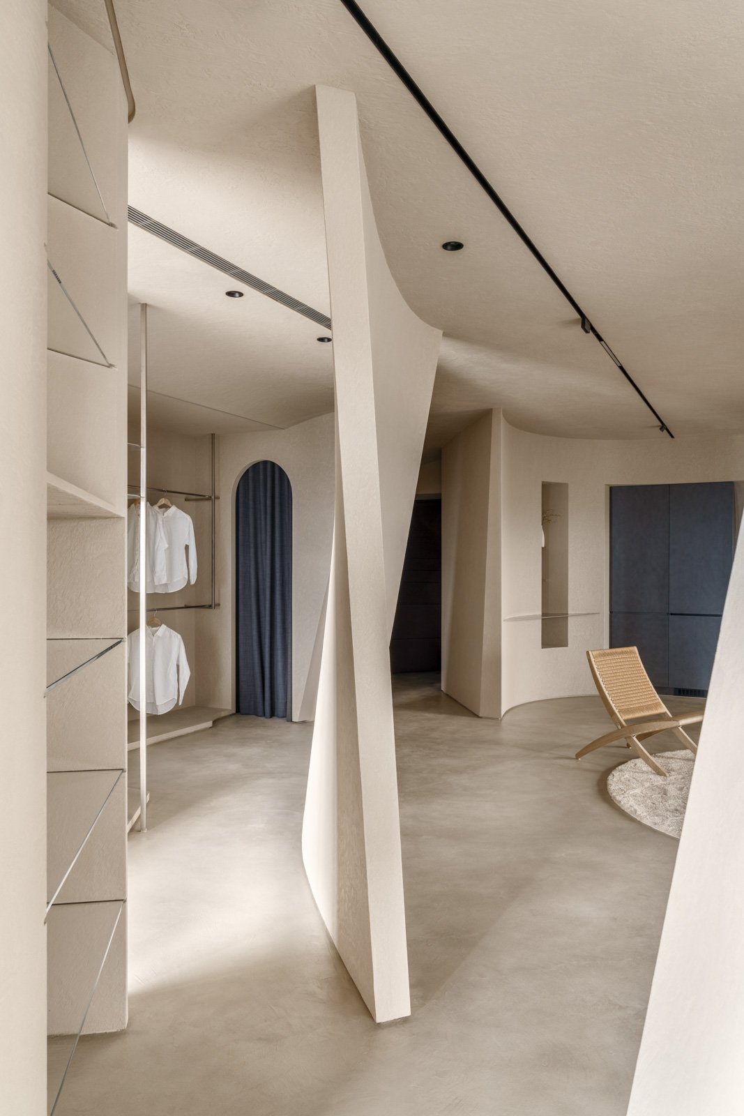
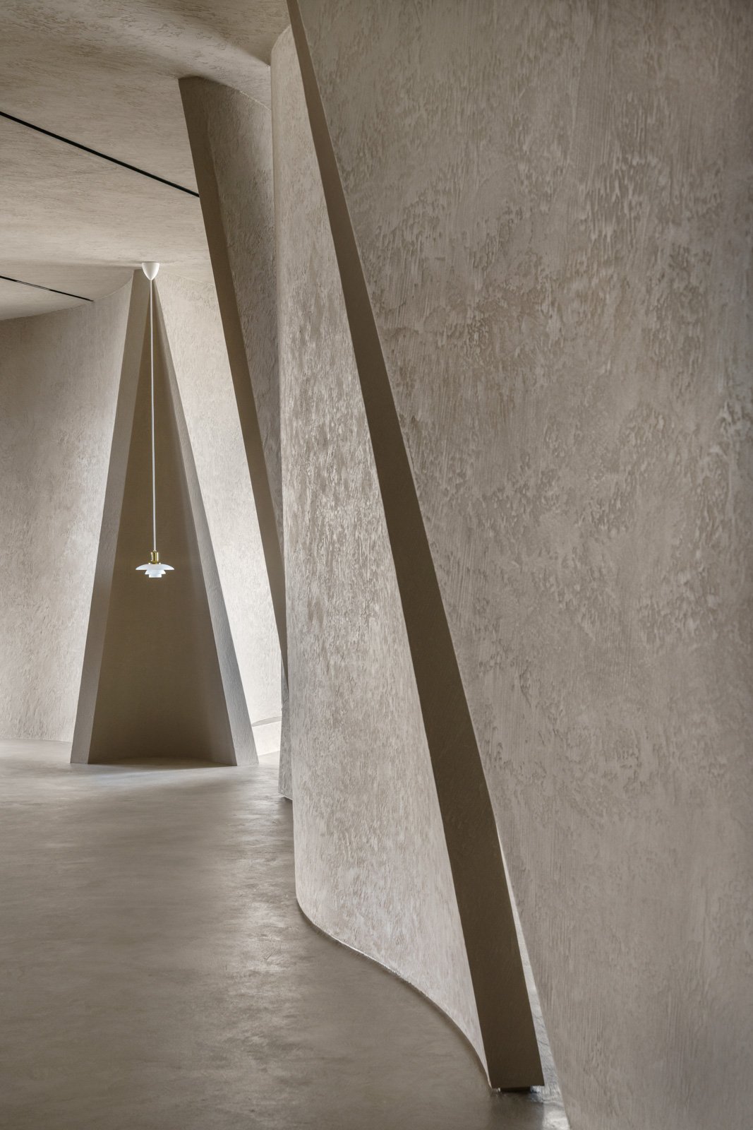
牆體之間的間隙中,光影的推進、漸變和舞動都清晰可見;礦粉塗料尤其突顯了每個隔間的曲線、輪廓,與流動姿態,使生活場域瀰漫藝術氣息與無受限的自由。
Between the interval gaps in the walls, the progression, variation, and movement of light and shadow are clearly visible. The use of mineral paint highlights the curves, contours, and fluidity of each partition, imbuing the entire living space with artistry and boundless freedom.


設計面積 Area: interior 100.7m2 / 30p I balcony 53.4m2 / 16p
專案類型 Function:住宅
設計主持 Director:程禮譽
專案設計 Master Plan:郭芸廷
現場執行 Site Manager:郭芸廷
空間攝影 Photography:YHLAA, 李易暹 Ethan Lee

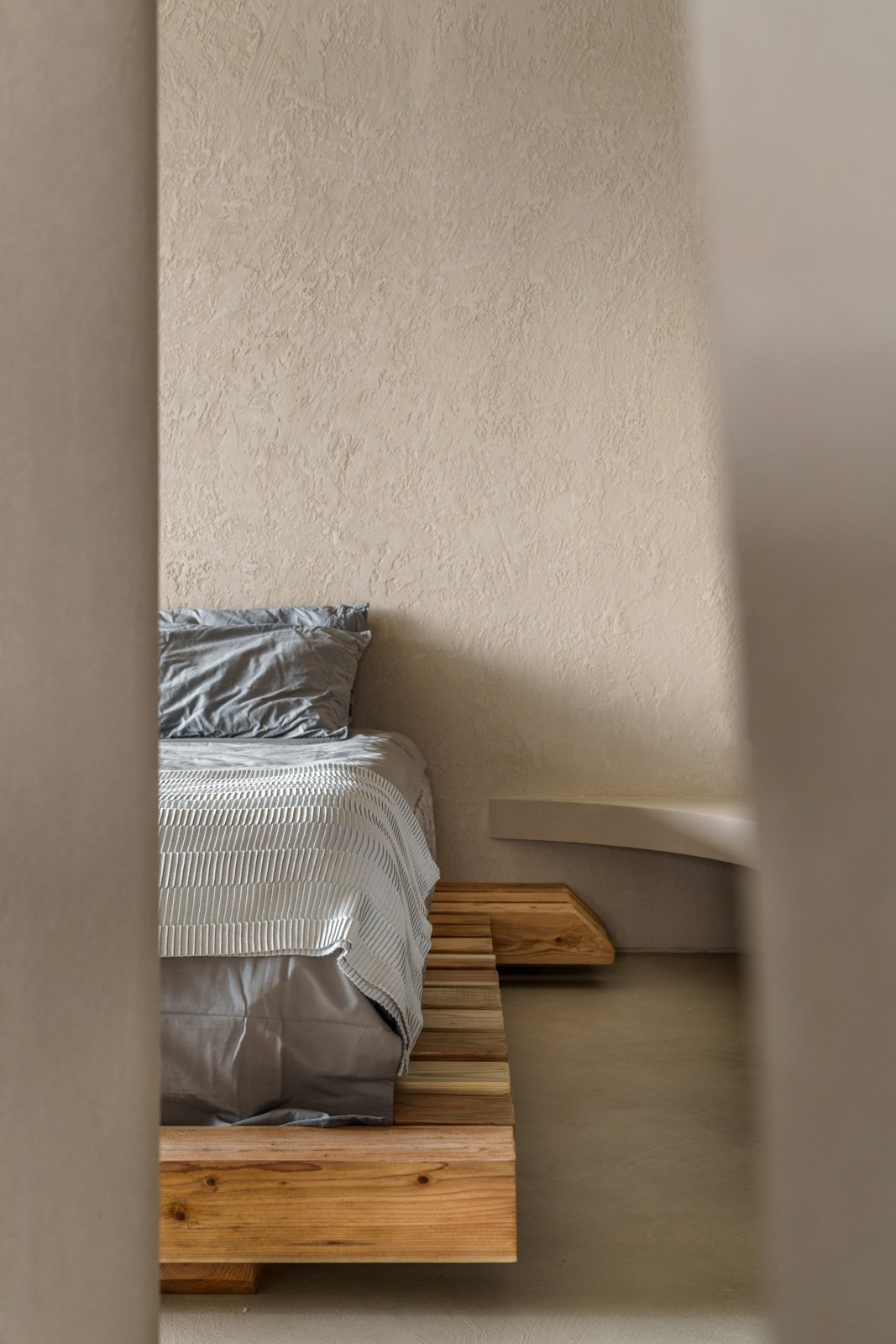
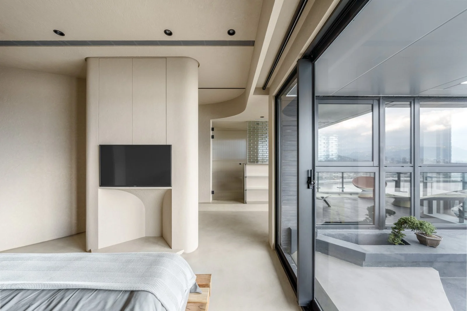
臥室一隅
A quiet nook within the bedroom

書房與盥洗室 Study and Bathroom

更衣間的隔間型態 Transparent partition between bedroom/walk-in closet


設計者的日記:
很少有機會能碰到執行『嘗試改變生活習慣』層面的案子,隔間實驗系列是這樣的類型.
我很喜歡的一位設計師Dieter Rams的Ten Principles for good design (1980) 裡面提到的其中一個原則是:誠實(Honest),不誇大產品的功能或價值,比如一張椅子不應該被包裝成能改善健康或提高社交地位,不誤導使用者並誠實地傳達產品能做什麼、不能做什麼是設計者的責任。
這個論點在我一開始讀到的時候內心很震撼,甚至帶有『過分政治正確了』的心情,在那個工業設計剛剛起步,行銷及包裝都百花齊放的時候,提出的想法在經過多年後直擊著我。
這個設計『對角線』的平面配置從設計者的角度來看很棒,是一個可以嘗試及驗證設計哲學的機會,但是它不會是一個住宅的常態配置,甚至可能它只能符合極少數人,這也是設計者必須知道的。
在找尋通用設計(尤其是住宅)的過程中,經驗的累積如nLDK的配置是一個很好用,也是大部分都市居住的理想型態或者說是真實的答案,值得花時間好好琢磨,
而開放式的隔間系統,必須捨棄隱私性,浪費空調能源以及許多生活習慣的調整。把平面配置成超過了原本使用者的習慣或需求,而為了展現設計慾望,可能不是一件好事。
但是當真的有幸碰到這樣特別需求的人的時候,滿足在通用設計中無法被滿足的部分,這同時也是設計者的責任;如果能將生活型態做一次轉換或是讓真的有需求的人看到案例的時候心裡產生『啊~原來我可能可以這樣居住呢!』,『好像這樣也不錯,我想試試看。』就很令人高興了。
Designer’s Journal
It’s rare to come across a project that directly attempts to change someone’s lifestyle. The Partition Experiment Series is exactly that kind of project.
One of my favorite designers, Dieter Rams, included a principle in his Ten Principles for Good Design (1980) that has always stuck with me: Honesty — not exaggerating a product’s function or value. For example, a chair shouldn’t be marketed as something that improves your health or elevates your social status. Designers have a responsibility to clearly communicate what a product can and cannot do, without misleading the user.
When I first read this principle, I was genuinely struck — I even felt it was a little too politically correct. Back in the early days of industrial design, when marketing and product packaging were just beginning to flourish, this idea must’ve sounded radical. But over time, it’s hit me more and more deeply.
From a designer’s point of view, the “Diagonal” floor plan is amazing. It’s a rare opportunity to test and explore a design philosophy. But I also know it’s not a typical residential layout — it may only suit a very small number of people. And that’s something a designer must acknowledge.
In the pursuit of universal design, especially for housing, formats like nLDK (the Japanese layout system) have become practical, even ideal, for dense urban living. They offer a reliable, experience-based answer — and they deserve thoughtful refinement.
On the other hand, an open-plan partition system comes with trade-offs: loss of privacy, less energy efficiency with air conditioning, and major shifts in daily routines. If we push a layout beyond the user’s habits or actual needs just to satisfy a designer’s urge to “express,” that might not be a good thing.
But when we’re lucky enough to meet someone with very specific needs — someone outside the universal model — and we manage to fulfill what standard design can’t, that too is part of our duty as designers.
If we can help someone imagine a different way of living — if they look at a project and think,
“Ah, maybe I could live like that,”
or “That actually looks nice. I’d like to try it” — then that makes it all worth it.

白天日光與夜晚人造光的相互變化

